

A Temporal Zoom of an Aspect of Carbon Dioxide
Limits of our current perspective

I had the privilege to watch a great video in my youth called “Cosmic Zoom”. This was a point in time view of what we knew about the very large scale and very small scale of the fascinating universe we are embedded within.
When I think about that impactful animation, I keep seeing how my perceptions change and even my thoughts become concentrated within each part of the zoomed experience, other things, seemingly important at one point, fade into the background, loosing significance entirely, while, other objects take up the attention of my mind’s eye.
A recent example of this, in real life, comes from images from the James Webb space telescope. Our view of the very large scale, has been greatly enriched by these images. This brought about much speculation and analysis, even the possibility of having to rethink some cherished ideas that was brought forward (as it should). This wave of differing views immediately brings about the defenders of the status quo. This is also, as it should be; however, instead of existing in the realm of sharing ideas, we now see the familiar, calling of names, such as: pseudo scientific theory, conspiracy theory, heretic. All things so familiar in recent history, but, we should never accept this behaviour as “the new normal”, or, any kind of normal. This exemplifies how ideas change based on how we zoom into, or, out of, a part of our perceived world. In the same way, our current view of the very small is constantly enriched by more new ideas and ideas that may not be new but has become relevant and new measurements and data in our current zoomed view.
All this, just to say, our sense of reality is formed by our access to perspective. Perspective, is a function of our ability to zoom from mind numbing details to mind boggling grand scope of what ever we are considering. I have found that more of my attention seems to be hijacked towards one particular perspective, and, it is sometimes difficult to break out of that. The additional perspectives can be actively blocked, new or alternative interpretations are more and more difficult to access, and, without these our own ideas become difficult to formulate, based on concrete data. We seem to be force feed dogma, and, starved on data and alternative perspective.
I am thankful there are a few non-traditional thinkers (no matter how hard they maybe to find) that dispel the idea that the universe gives a damn about our mental construct of it within our limited frog brains. However, those constructs (when built on true and repeatable observations, expressed clearly and falsifiable) helps to guide us on more solid ground, when we need it. It also enriches our view and experience, regardless of what the larger or smaller part of the universe we are concentrated on. I think that honest humility is the best preparation for a journey of discovery.
For myself, there is a need to consider the limitation of my understanding. If not, I might fall prey to the mindset exemplified by the old Chinese story of the “frog in the well”, where the patch of sky, allowed by the wells opening, becomes the center of the frogs world view. So given that long preamble, I will start my intiial steps into the world of carbon dioxide wonderland.
Now, to indicate why I want to look at carbon dioxide in particular. I must admit, it is because of all the incessant doomsday talk about how this gas will be the end of us. Something presented in this dramatic fashion certainly suggests that I should take a closer look for myself, specially since they propose fundamental changes to our societies to satisfy their agendas. I feel in the current climate of scientific discourse, where special interests buys “scientists” endorsements for their preferred world view, it has become obvious, that it is necessary to look into matters for myself. If I choose to rely on the opinions of others, I pick and choose who to listen to and which ideas I internalize.
It is within this context that I decided to accumulate data, from sources that are available to me, on the concentration of this gas in our atmosphere over time. My plan was to create a combined dataset, that, spans as large a part of the time life existed on earth. I also wanted the search for this data to be accomplished within a reasonable time scale. Currently, I have accumulated data up to the period just after the extinction of the dinosaurs. It is this dataset that will be used on this temporal zoom exercise. Our journey will be spatially fixed on this blue marble and we will zoom along the temporal dimension ( where as, the animation “Cosmic Zoom“, took a fixed time and zoomed spatially). I have neither the skill, or, knowledge to duplicate the effort of the “Cosmic Zoom”, so my effort here will be much less visually impactful. I will use a series of graphs that shows the trends of carbon dioxide concentration over different time scales. One might ask why go through this exercise at all? For me, this exercise has done two things,
It confirms what I remembered from my past encounters with this subject, from a geological time scale perspective (which is quite different from the shirt rending description we are currently entertained with),
and, it has enriched my view of the current status within this framework.
The dataset consists of three main parts (appropriate citations can be found in the links below):
The most recent is from Mauna Loa observatory (1969-2022 AD),
An intermediate set Composite Antarctic ice core data (22-805742 yr ago),
The oldest set is from paleo-CO2 (0.0013-67 Myr ago).
I found the last site to be quite informative and well setup, well worth a visit. As I cannot independently verify each of these datasets, I take them on face value. They do contain error bars, but, their inclusion within this analysis would not materially change what is a cursory view and analysis of this gas in our atmosphere. I also recognize that the datasets are from diverse geographical locations, but, hopefully, the global level information is intact and fairly represented. I rely on the clustering of the most diverse datasets to be of use in that regard.
To put my bias up front, I currently view carbon dioxide as an integral part of our planet, for as long as this blue marble existed. It has certainly been a crucial part of the vast majority of life on earth for the entire period of their existence. It must be from that context that we draw our own view of how exceptional the current situation is. For me, I am on the other side of, currently trendy, doomsday fashion. Perhaps, with more digging, I will alter my view, hopefully, my brain is not too ossified to do that.
Further, I am aware that carbon dioxide is a, so called, greenhouse gas, and, it has a potential role to play within the warming and cooling periods of the geological record, however, it is not the instigator of warming, nor, do we know fully how other myriad of variables interact which contribute to the whole discussion, nor do we really even understand the magnitude of its influence. We may not even have a handle on what those other confounding variables are. This is not just a function of my limitation, it is the limitation of our current understanding of the whole arena of complex systems. When I say complex system, I am not just referring to some loose description of what small minds, mine included, can understand. I am referring to the intrinsic chaos within the system and any error within our modelling and partial understanding can result in extremely wrong predictions and understanding. This is why, I feel, the geological record is so important, it puts nuance to the one dimensional doomsday rhetoric we face, and, provides perspective.
First, lets see how not to view this diverse dataset without any editing on one plot.

Let me describe what I see from this plot. The bottom (horizontal) axis is the time axis, measured from present, in millions of years (Note: the current time is on the right and the more distant past to the left). Its values range from 0 (when we are now) to 70 million years ago. Seventy million years ago, is around the end of the Cretaceous period to the beginning of the Paleogene period. This is where we mark the extinction of the dinosaurs. This period is almost entirely contained within the Cenozoic era.
The word ‘Cenozoic’ means ‘new life’, which, is just a part of the pageantry of life on earth, the Mesozoic (middle life) and Paleozoic (old life) precedes this along with even more.
One would need to go much much further back say 3,000 million years (Myr), in the Archean, to see the start of what we call life on earth, 500 Myr to see the first fishes in the Cambrian, 250 Myr to see the arrival of the first mammals in the Triassic and finally we see the arrival of Homo sapiens around 0.3 Myr ago. This means to me, the time line covered by the plot, is just a very partial zoom of even the life on earth, which, is inextricably intertwined with the God given gas of life we call carbon dioxide. The graphic below shows this march of life through time from Britannica.

This brings us to the second axis . The right (vertical) axis is the inferred and measured CO2 concentrations in parts per million (ppm). We can see that most of the data resides in a band from 100 to say 2000 ppm. A fairly large range for sure, specially considering the current debate is in the range of around 400-500 ppm. The barely discernible orange dots apparently clustered around the 0 year mark are the data from the Mauna Loa observatory, which, started its data collection from 1969 and is a very small portion of the time span. The highest points, of that dataset, are around the 500 ppm mark (we will zoom into this portion of the data later). All the ice core data are represented by the magenta dots which is also a very insignificant part to the total and is clustered around the 250 ppm level (of course we will zoom into that portion as well). All the rest that we see on the plot, the blue dots are from the paleo dataset. It represents most of the time line here and we must not forget this is still just a small part of all the time line of just when life occurred on earth.
The black boxy lines represent the rolling maximum and minimum envelope of the paleo dataset shows us the zones of where the data lies. The magenta line is a rough smooth fit through the paleo dataset. This line is a fairly conservative continuous view of the CO2 concentration of this dataset.
Even at this stage, we can see that life on our blue marble has lived thrived and died at ranges of CO2 concentration well beyond the ranges we discuss today and mostly at higher levels. Of course, we must be careful and leave the potential that the biosphere was much different than it is today and our proxies for CO2 concentration is not directly relatable to the concentrations today (which I think is much less likely).
At this point, we can begin our temporal zoom journey. We will start where we have potentially the best understanding and that should be the recent past. The dataset that best shows this is the Mauna Loa dataset. The graph of this dataset is shown below.

I will again share my observation of this dataset. First, the horizontal axis is now denoted by dates, as appose to age in Myr, used in the previous plot. This, to me, is more intuitive, since many of us probably lived through this period, and, used these dates in our, day to day, accounting of time. The dataset terminates at the end of 2022, so, is not current, but, that will not bother me much, as I have not seen any significant catastrophes that would make this dataset irrelevant.
Before I leave the last sentence hanging, there has been a significant temperature rise in the recent days and I wrote a summary of my look at that event, if interested, you can find that analysis here, however, be warned, the tale is not one of carbon dioxide.
I will not examine the vertical axis from this point on, as, it is the constant throughout our little journey, representing the concentration of carbon dioxide. The only importance is to note the range at each stage.
By examining the concentration curve within this plot, I see is a band of data (in green), with a few sporadic spikes thrown in, that is contained within a monotonic slowly increasing trend (this trend is the big bugaboo, which we will return to), starting between 330-340 ppm in the late 1960’s and ending between 404-428 in late 2022. The quasi-annual cycles are also very prominent. These represent the tie-in of CO2 with the seasons (plants takes in CO2 in the summer through photosynthesis, and, in winter they become dormant as well as dropping dead foliage which decays and releases CO2). This simple explanation is intuitively palatable and is called the fast part of the carbon cycle. I have found other features to this not so static part of the so called “carbon cycle“ as well, but, I am not ready to share my look at that as yet, and this is going to be lengthy as it is.
The slower trend, I have previously described, is called the slow part of the carbon cycle. This is often put on the shoulders of human activity (which, we are assured, is mostly associated with fossil fuel usage). This emphasis, in the doomsday mindset, is all about the inexorable climb of the level of CO2 concentration, and, how many nasty things will befall all life on earth. However, we are informed by the previous plot that this range is certainly not significantly outside the longer geological view, so we need a more nuanced and less hysterical understanding.
I am not saying, that the added carbon dioxide due to human activity is not a part of this trend, I am skeptical of this as the sole driver. For instance, we know that there are other observable responses to the increase in carbon dioxide, such as, the current greening of the earth from satellite observations.
The myriad feedback loops in the simplified carbon cycle is not static, nor, as I see it, complete. It is also interesting, that, the plotted trend does not alter much by presence of the spikes. If those are not noise artifacts, then, we have to say that the CO2 story around this range is quite stable to sporadic changes (a good thing, as the opposite would mean we would probably have a much less hospitable planet we call home.
The mechanics of CO2 being a greenhouse gas is well known and well studied. The correlation of temperature to CO2 concentration is also quite obvious, though not exact. However, to think that CO2 drives the whole process is quite unlikely. I doubt that there are many climate scientists who believe this, unless they are paid or coerced to, perhaps that is too strong a statement.
As I mentioned earlier, the climate cycle is tied to many variables, and, tied in a chaotic fashion. I think the interactions of these variables are not fully understood and to think that we can just pull on the CO2 lever (I am not even sure we could make a significant dent there) and we can move the climate up or down at will, with total control, seems almost at the level of fantasy.
This reminds me of an experience while working in a certain company, new management brought in a consulting group to help our company do better. The consultants explained, at a group session, that, they have looked at a number of variables of some of the best companies in our business and determined that a subset of these variables were most indicative of the best and most successful companies. They then, laid out the levers that they presupposed would control these variables, and, as a finale (only the drum roll was missing) we were assured, that, if we pulled all these levers, we would shoot up to become the best of the best.
It was then, that a brave and insightful member of our group, asked a question. First, he pointed out, that, even according to their own observations, within the top three companies, they have identified, none of them pulled all the levers they are suggesting we pull. He then asked, if the consultants knew what type of interaction these levers have on each other (are they assuming independence) so that a particular set of levers pulled would result in optimum performance? There was no answer from them. This lack of an answer from the consultants, was a clear answer to me, thanks to my insightful colleague.
In complex systems, it is very difficult to know what is required to maintain an optimal output. It is even more of an issue where all the variables may not be known, and, of the ones investigated, the mutual interactions are not more fully understood. It is easy to run a complex model with many variables and force fit the past data by parameter seeking algorithms and assume future predictions are concrete. Our company attempted to pull the levers, and, guess what, we did not rocket up to join the best performers. This was true of other companies, I later found, who used the same consultants, as well.
I am always wary of modellers of complex, non-linear and chaotic systems. Our climate, to me, is a preeminent example of this type of system.
Lets continue to zoom out and include the next tranche of data from the ice cores. Before we zoom out too far. Lets take a look at the carbon dioxide story from about 1000 year (1 Kyr) ago till now.

From this perspective, we come away with the feeling that the last couple of centuries are quite exceptional. This is the carbon dioxide counterpart of the famous hockey-stick temperature plot. The climb does seem to coincide with the start of the industrial revolution, about 400 years ago. It would be interesting to see if one could estimate the industrial carbon dioxide output over time, sum it up and see how it matches. The green dots are the ice core data, and, the orange dots are the Mauna Loa data we looked at before. There is a lot more to the ice core data than represented here, so lets zoom out some more, say to 100 Kyr .
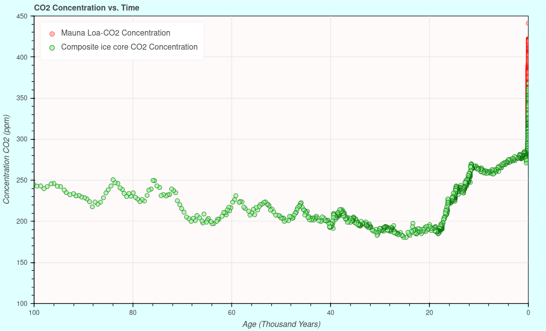
From this plot we are looking back a hundred thousand years (Kyr). At that point in the past, we see a trend of gradual decrease of carbon dioxide until about 16 Kyr (250 ppm to 180 ppm), where we see a relatively sharp increase to 270 ppm. A short dip to around 5 Kyr and we climb from about 260 ppm 280 ppm around 500 years ago. At that point we take a small dip, as seen in the previous graph, which is not apparent here at this scale, where we start our steep climb, and our current conundrum.
Again, we are confronted with what appears to be an exceptional event, since we are in the mood, or, put in the mood, of self-loathing, it must be, we the bad little people, who are murdering the earth. Of course, I am just being hyperbolic, I have written a note on energy use, where I point a finger at those who, I consider to be the real culprits, what are their significant sacrifices, if this issue was so damned important. It’s time for another zoom. This time we get a repeated story, over and over. We start to see that, what appeared to be exceptional, is still exceptional.
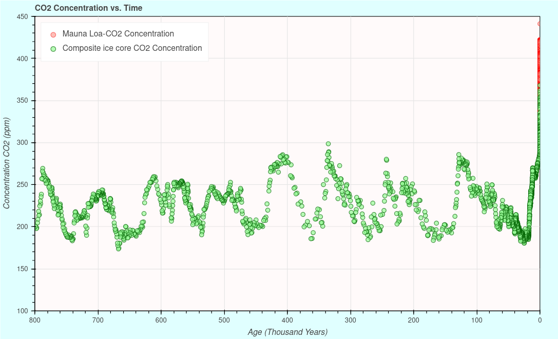
Yes, that little red tail (associated with the Mauna Loa data) at the end of the plot is still there and point straight up, towards our DOOM! Just a bit of levity, in an otherwise, less than exciting plot. What we see here is a series zigzags leading towards our pointer of doom. If this was all we see, it would seem the earth kept the CO2 level between 170 to 300 ppm forever, until, we bad guys came along and caused mother earth to give up on us and threaten to cast us out of the garden for a second time. On that note, we should now go all the way and add final swath of paleo data.

The first thing I notice, when viewing this plot, is the vertical scale is stretched ten fold. This points to the range of sustained levels of carbon dioxide has been much higher and lower than our current time. Over this entire period, the current CO2 levels are relatively low. Life carried on throughout this entire period and beyond.
There were many other potential spikes of carbon dioxide increase of much greater magnitude than our current one. All these exceptions equalized in geologically short periods (of course, compared to the short span of human life, or even, the span of existence of our species fades to insignificance). When viewing this dataset, one must suspect that reformulation of the idea of fast and slow trends of the carbon cycle might be in order. We should, maybe, even rethink the idea of what doom we are actually referring to. To me, this is an extremely stable environmental variable that is conducive to life at many levels of concentration.
I am getting a length warning, so, I will wrap-up. I should probably say less, and, each person formulate their own opinions of the temporal zooms we have looked at. Each one gives us a different focus, and we can be led towards different conclusions, if we proceed without seeing more data. There appears to be a whole industry based on a myopic view of this one variable. In my opinion, that industry tries very hard to push its preferred point of view for its own benefit and survival, not ours.
The animation ‘Cosmic Zoom’ really is an interesting investment of a few minutes of your attention. It makes you think about how one view point will not let you gain an opinion of what really matters, even to yourself. You need to arm yourself with as much perspective as you can. This best predisposes you when choices are to be made. If your don’t choose, or, are afraid to, others, with selfish intentions, will most likely do it for you. Maybe, I am just too negative.
I'm 5 minutes and 25 seconds into it Brown - it has zoomed into the level of blood cells on the boy with oars and a dog in the boat - this is just a minute away from when it was zoomed out so far - it was off into galaxies beyond imagination in a way.
I'll watch the rest now and won't comment again - but this is why sometimes it seems to me I get the chance to meet up with others who have ideas to share - thankyou.
Ken
Typed above:
~
The animation ‘Cosmic Zoom’ really is an interesting investment of a few minutes of your attention. It makes you think about how one view point will not let you gain an opinion of what really matters, even to yourself. You need to arm yourself with as much perspective as you can. This best predisposes you when choices are to be made. If your don’t choose, or, are afraid to, others, with selfish intentions, will most likely do it for you.
~
I'm about to watch it now - just circling back and finding this is fun for me!
Thanks,
Ken